How I Map Order Flow Levels in TradingView for ES & NQ
A practical chart tutorial: turn a daily level list into organised zones, then use context instead of treating every touch as an entry.
Updated October 8, 2026 · 10 min read

Educational walkthrough based on my own video and its transcript. These are historical chart examples, not current levels or trade recommendations. Futures trading involves substantial risk; selected reactions and backtesting do not guarantee results.
I plot order flow levels in TradingView as manual price-area drawings, with separate templates for intraday and higher-timeframe levels. I filter the relevant areas, group the drawings and look for confluence with market structure. The drawings display a preparation map—not an automatic indicator, entry instruction or guarantee of a reaction.
What order flow levels in TradingView mean in this walkthrough
Order flow levels in TradingView can mean several things: an indicator's plotted output, levels derived from a footprint, or prices drawn manually after separate analysis. This tutorial is about the third. I show how I transfer my own ES/NQ higher-timeframe and intraday liquidity levels onto the chart.
The charting task and the analytical task are different. Drawing a supplied price correctly does not mean you have learned how it was calculated. My broader workflow uses ExoCharts for orderflow analysis, but this video is a TradingView mapping demonstration, not an ExoCharts configuration lesson.
It also is not a generic POC, VAH or VAL tutorial. Those terms have their own definitions. The levels discussed here are my own liquidity-level framework, which I describe in the opening as backtested over five years. The video does not publish the underlying statistical study, so there is no defensible win-rate number to quote.
If the underlying terminology is new, start with orderflow trading explained. Here the question is narrower: how do you make the information usable on a clean chart?
Watch my actual prop firm setup
The complete walkthrough behind this guide. Chapters follow the video's transcript; prices on screen are historical examples, not current trading instructions.
- 0:00 — My prop firm setup and backtested levels
- 0:25 — Daily ES/NQ higher-timeframe and intraday levels
- 1:28 — Marking levels and saving TradingView templates
- 2:30 — Copying drawings and filtering previously hit levels
- 3:55 — Higher-timeframe levels and intraday confluence
- 4:58 — Grouping and hiding chart drawings
- 5:47 — Anchored VWAP and historical level examples
- 6:49 — Market structure and why location matters
- 8:13 — TradingView, Tradovate and Tradecopia execution
- 8:46 — Illustrative limit entry, stop and staged targets
Step 1: separate higher-timeframe and intraday ES/NQ levels
At 0:25 I show the level posts and explain that both ES and Nasdaq have intraday and higher-timeframe references. Treat those as two layers rather than one undifferentiated list. A broader location and a local session location can matter for different reasons.
Before drawing, check the instrument and the date of the level list. Do not copy ES prices onto an NQ chart, or assume an old screenshot is today's preparation. Futures contracts can also change around rollover; ensure your chart and source refer to a compatible contract or series before treating the displayed price as exact.
| Layer | Purpose | Chart treatment |
|---|---|---|
| Intraday | Local areas for the current preparation | Use a consistent intraday template. |
| Higher timeframe | Broader reference areas | Use a clearly distinguishable HTF template. |
| Market structure | Trend, rejection and location context | Keep separate from the level drawings. |
| Working orders | Actual execution and protection | Verify in the trading panel; a drawing is not an order. |
This is not a requirement to add four indicators. It is a way to stop the chart from mixing a location you are watching with a position you have actually opened.
Step 2: draw the first area and save an intraday template
The hands-on demonstration starts at 1:28. I mark a price area, open its settings and use a saved template. The transcript includes 7805.75 as a historical example. That number is useful for following the demonstration, not as an ES level to trade now.
At about 2:03 I describe placing the chart area a few points around the reference. A zone allows a visual distinction between the exact quoted price and the area I am watching. The demonstration does not establish a universal width, and an ES example should not become a mechanical NQ rule.
Set a descriptive name and consistent appearance, then save the drawing as a template. The point of the template is consistency: every new intraday area should be recognisable without reopening all its settings. TradingView's exact menu labels can change, so follow the current drawing settings and the visual sequence in the video.
Do not confuse a drawing template with an indicator template. This sequence saves how a drawing looks. It does not add an automatic calculation, a trading algorithm or a connection to the level posts.
Step 3: duplicate drawings without carrying over the wrong price
From 2:30 I copy the first drawing and move through additional intraday areas. This is quicker than creating each rectangle or price zone from scratch. It also introduces an obvious failure mode: the style can be right while the coordinates are wrong.
After each duplication, verify the new price against the source. Do not assume that dragging an object near a number produces the exact intended area. If several levels are close together, check each one independently rather than let overlapping labels conceal a mistake.
The spoken subtitles become fragmented while I enter some of the prices. For that reason this guide does not reconstruct a complete historical level list from the garbled digits. Watch the chart at the chapter link if you need the visual example; use your current dated source for actual preparation.
A final audit takes less time than fixing a misleading chart during a fast move: read the instrument, the level label and the coordinates together. Then zoom out and check that the resulting structure makes sense.
Step 4: filter already-hit levels and areas still forming
Around 3:16 I explain that I am not placing one area because price is currently there and the level is being formed. I also refer to an already-hit level that I leave off this chart. The key is relevance, not completeness.
This does not prove that every level becomes worthless immediately after one touch. It shows the filtering decision used in this particular walkthrough. Avoid inventing a universal first-touch-only rule where the video does not supply one.
For your own review, distinguish an untouched area, an area already tested and an area still developing. If you retain an old area for context, label it accordingly. A chart where every historical rectangle looks equally current is harder to read and easier to misuse.
Before the session, ask which areas actually change your plan. If an object does not affect location, direction or invalidation, hiding it may make the remaining information clearer.
Step 5: add a separate HTF template and look for overlap
At 3:55 I switch to the higher-timeframe levels. I use a larger, visually distinct drawing and explain that it can also be saved as a template. In the video the HTF style is bigger and red; the important distinction is recognisability, not a mandatory colour scheme.
At 4:36 I point out a higher-timeframe level close to an intraday level. That is the overlap I like to see. Instead of treating two nearby lines as two separate trades, consider whether they identify one broader decision area.
Confluence is not guaranteed support or resistance. Two levels can agree and still fail. The practical benefit is prioritisation: you can spend more attention on a meaningful overlap and less on isolated locations without a clear reason to act.
To see how a location fits into an executed trade rather than a drawing tutorial, read my prop firm trading strategy recap. Keep the planning example and the actual trade record separate.
Step 6: group the drawings so the chart stays readable
At 4:58 I open the drawing list, select the objects and create a group. I suggest separate groups for intraday and higher-timeframe levels, even though I demonstrate a single group to keep the explanation short. The group can then be hidden or shown together.
This is especially useful when you also use horizontals, trendlines or other structure annotations. Switching a group off temporarily lets you inspect the underlying price action without deleting your preparation. It also makes it easier to catch a duplicated or stale drawing.
Name groups clearly enough that tomorrow's update is obvious. A practical arrangement is one group for current intraday areas, one for HTF references and another for separate technical-analysis drawings. That arrangement follows the distinction in the video rather than imposing a complicated workspace.
Hiding a drawing group changes the display only. It does not cancel a working trade, remove a stop or disable a follower account. Chart organisation and order management belong to different parts of the workflow.
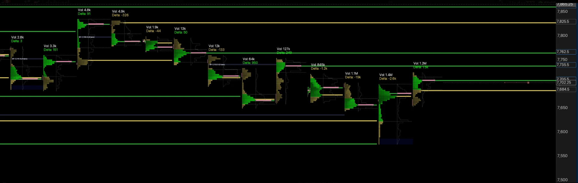
Step 7: combine the map with anchored VWAP and market structure
At 5:47 I point to an anchored VWAP at a level as another possible piece of confluence. This video does not teach a universal anchor-selection rule or claim that every VWAP overlap is tradable. If you use it, you need to know why that particular anchor is meaningful.
Around 6:49 the focus shifts to market structure. I discuss a new high and rejection, explaining why buying high in that context can be riskier. The map remains the same type of tool, but the quality of a proposed trade changes with what the market is doing around it.
That is why “price reached my area” is an observation, not the full trade thesis. You still need a direction, a reason for entry and a place where the idea is invalid. Read the VWAP trading guide for broader context instead of treating this short reference as a complete VWAP system.
The historical reactions near 6:24 and 7:14 illustrate areas I had shared. They are selected examples, not a full track record. A responsible review records failed reactions and skipped setups as well as the visually impressive ones.
From a chart map to a planned trade—not an automatic signal
The final section, starting at 8:13, briefly explains my TradingView-to-Tradovate execution and Tradecopia workflow. Near 8:46 I illustrate a limit order, a stop and staged targets. A box on the chart does not place any of those orders by itself.
Before placing a limit order, decide whether you want a resting entry or whether the idea needs additional confirmation. Calculate the dollar risk from instrument, stop distance and size. Check the account and working protective orders rather than assume the drawing has done the risk management.
For the full toolchain and correlated-account risks, use my prop firm trading setup guide. This article stays focused on mapping and reading the levels so it does not duplicate a copier configuration tutorial.
If you want the daily ES/NQ higher-timeframe and intraday levels I watch before the open, with bias, setups and tutorials, you can find the offer on the Sato VIP page. Those levels are preparation and context; members make their own entry, confirmation and risk decisions.
The finished chart should answer a small number of questions clearly: where am I interested, why does that location matter, and what would make the trade wrong? If it only looks impressive, the preparation is not finished.
Last updated 2026-10-08. Based on the supplied transcript and October 8 video. Platform interfaces can change; historical prices and examples are not current trade recommendations.
TradingView order flow levels FAQs
How do you plot order flow levels in TradingView?+
I manually draw the supplied price areas on the relevant futures chart, use separate templates for intraday and higher-timeframe levels, and organise them into drawing groups. The video demonstrates the workflow; TradingView is displaying my levels rather than automatically calculating them.
Are these TradingView order flow levels an indicator?+
No. This walkthrough shows manual drawings and saved drawing templates. It does not install an automatic indicator or provide the proprietary calculation behind the levels.
What is the difference between HTF and intraday levels?+
HTF means higher timeframe: broader reference areas. Intraday levels provide more local session context. I mark them differently so I can see when a higher-timeframe area overlaps an intraday one.
Do I need ExoCharts just to draw the levels?+
Not to manually mark supplied prices in TradingView. ExoCharts is my orderflow analysis software, but plotting a price someone supplies is different from independently deriving it or confirming a trade using orderflow.
Should I place every previous day's level on the chart?+
No. In the demonstration I filter out an already-hit example and leave out an area still forming. Review whether a level remains relevant rather than accumulating every old price on the chart.
Does a level touch mean I should buy or sell?+
No. A touch identifies a place to assess a trade. Direction, market structure, confluence, invalidation and account risk still matter. A limit entry is one possible execution choice, not a universal rule for every level.
How wide should the zone be?+
The video shows an intraday drawing extended a few ES points around a reference price, but does not establish a universal zone width. Do not apply that visual example mechanically to NQ or to all volatility conditions.
Are these POC, VAH and VAL levels?+
The offer shown is Sato's own higher-timeframe and intraday liquidity levels. Do not relabel the whole set as point of control or value-area boundaries. Those are separate analytical concepts.
Does the video provide a tested win rate for this method?+
No. Sato says the method was backtested over five years and shows selected historical reactions. The video does not publish a full backtest, sample size, win rate or independently verified expected return.